Prototype stage
The "GigHub" app is currently in the prototype stage of the UX design thinking process. This phase focuses on transforming ideas and concepts into physical interactive representation that will show how the app will look and work. This phase focuses on creating a prototype that contains key features like gigs, video and audio content, time zone, connectivity map, mental health check ins, chat, form, post and events features. This prototype will be later used in the test stage to be able to refine the product and make sure that the final product work seamlesslyPrototype goals
1. Identify and prioritize the most crucial features and functionalities for each section of the app.
2. Create low-fidelity wireframes that illustrating the basic layout of the apps content and feature
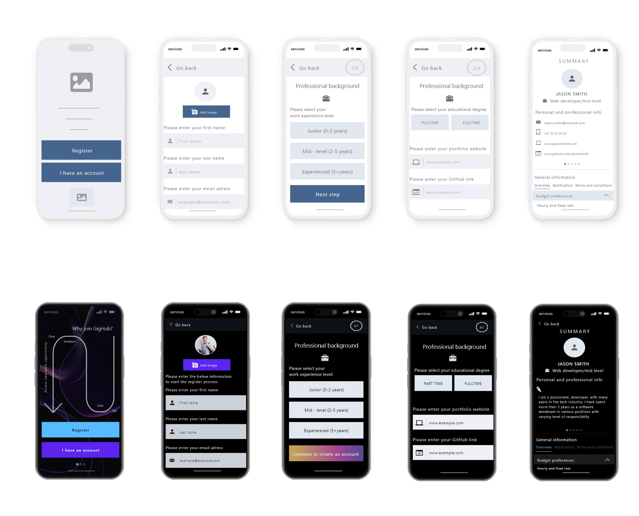
3. Create a mid-fidelity prototype that includes more advanced features like descriptive text, clickable buttons, links, and other design components that the user can interact with. Make sure that the prototype is accessible and follows the interaction design principle. Prepare the mid fidelity wireframe for prototype testing
4. Create a high fidelity prototype that includes all design elements that closely resemble the final product that the user can interact with. Make sure that the prototype is accessible and follows the interaction design principle. Prepare the mid fidelity wireframe for prototype testing
MoSCoW method
Prototype
MoSCoW
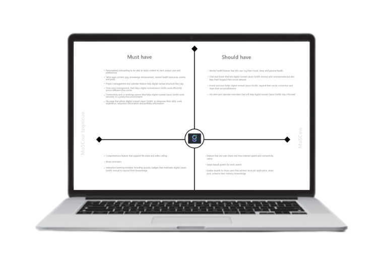
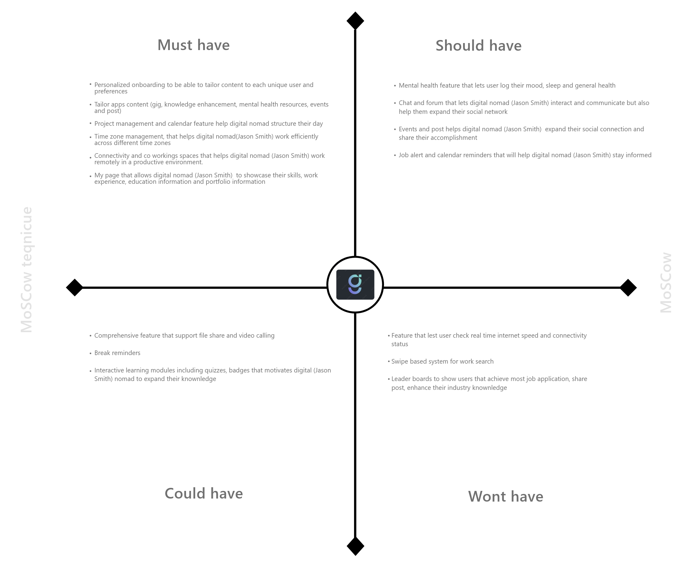
The MoSCoW method is a helpful tool for prioritizing features and functionality that are critical, necessary and relevant for the core target audience of the app. ... It makes sure that the most important feature and function for the user are addressed first. This methods also help in deciding which feature is essential to focus on first and then add extra feature if there is enough time and resources
Persuasive design

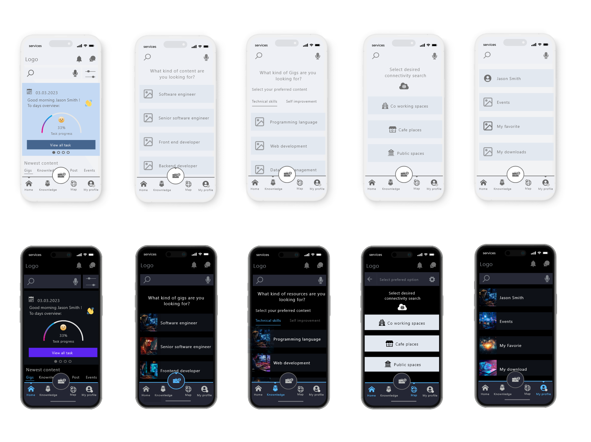
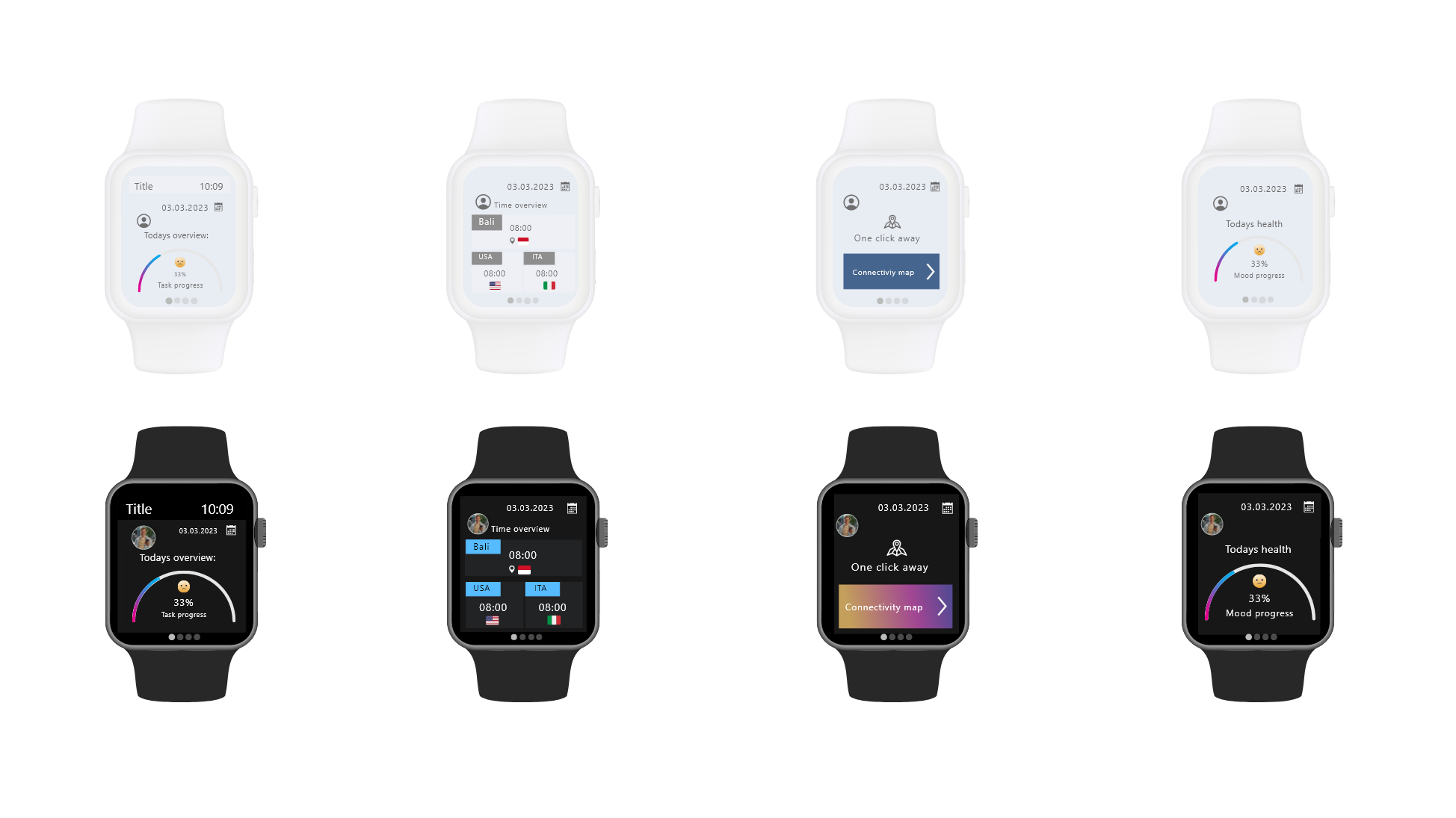
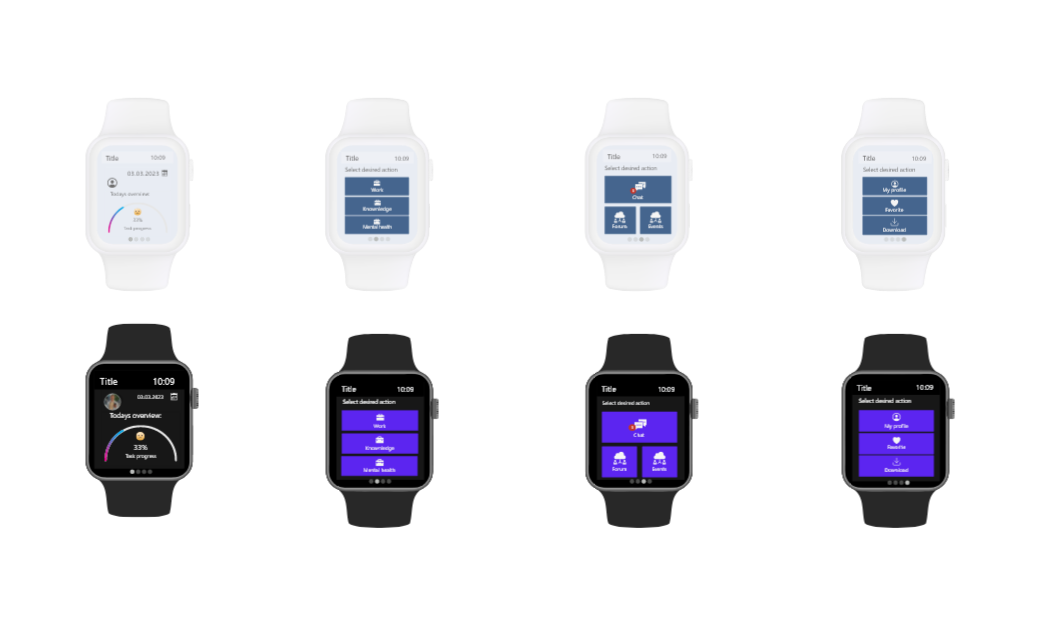
The app design focuses on the F scanning pattern, layer cake pattern, and spotted pattern, white space, headings, short text, different font size, colors, shape, icons, label and images. ... This will make it easier for Jason Smith to quickly scan the apps content and locate relevant information. These elemens contritbute to the visual appeal of the design and play a role in creating a positive impression
Familiar design functionality such as carousel, accordions, tabs, modal, drop down, input field, read more/read less functionality are used. ... This aligns with behavioral design by focusing on providing interactions that are intuitive and recognizable to users, allowing him to interact with the app effectively without the need for extensive learning. Since Jason Smith time and motivation are limited the design aims to minimize cognitive effort and enable him to perform activity efficiently. This aligns with behavioral design principle that prioritize ease of use and task completion
The app has a well structured site architecture, provides a good combination of images, text, buttons, icons, familiar design components like accordion, tabs, modal, drop down to make Jason Smith reach the goal in an efficient way regardless of his experience level. ... Jason Smith can easily navigate through activity options, utilize back and forward buttons, apply filters, track progress via breadcrumbs, access drop down menus and explore off-canvas content. The step by step information during sign up is designed to accommodate users like Jason Smith who have a limited attention span. To avoid overwhelming him with text, most information is condensed within accordions and off-canvas elements, allowing users to click and expand section for further reading. The app place users in full control over their action, activity, reading preferences and task. Overall, the user experiences is seamless, cohesive, and intuitive, offering a logical, fun, journey throughout